


USA NETWORK - BRAND
USA Network is not only a place where characters live, it’s a place where characters come alive. Where we can celebrate our uniqueness and applaud our similarities. Where we can connect with the people we see on the screen and on the street. Where we can look at ourselves and be entertained, or inspired, or humbled, or simply proud to be who we are.
The words above are the ones that kick off the USA style guide. They help establish the design philosophy and the voice for the network. Everything within the brand stylized and sophisticated, but still approachable and even familiar.
The USA Network "Characters Welcome" brand was in a constant state of evolution, and every time I wrote the brand guide, I found more depth to the brand, and discover new ways to keep the brand connected not only to the network properties, but to the viewers and to the core of the Characters Welcome philosophy.
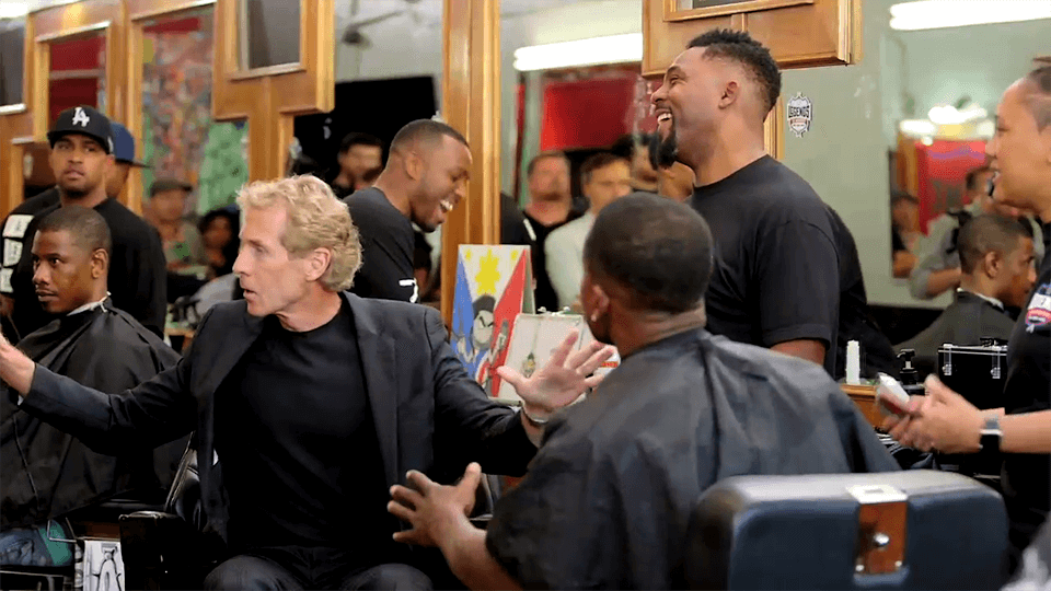
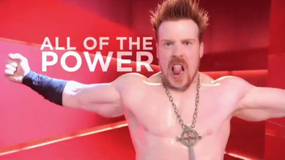
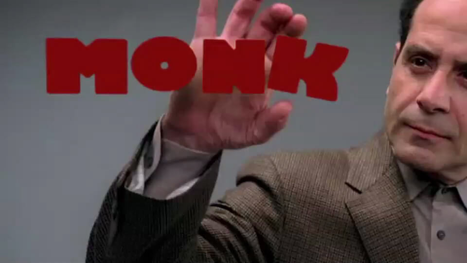
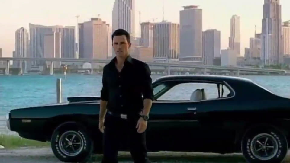
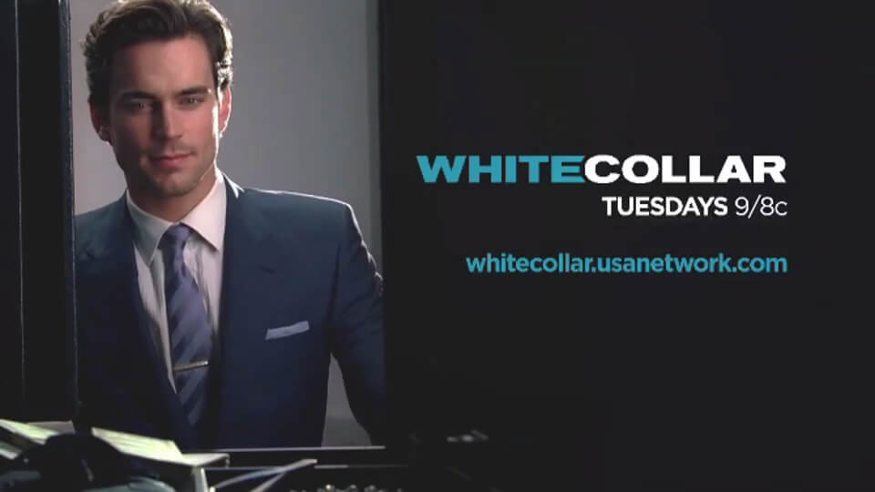
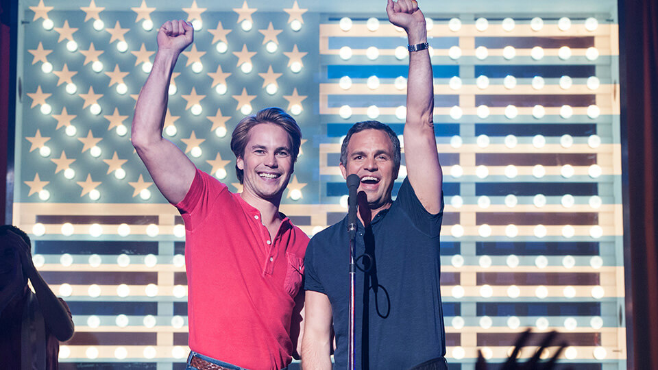
The original programming on USA Network was the lifeblood of the overall brand. It was through the characters on that the clean design, strong typography and cinematic portraits were able to create an accessible brand message.
Each show had its own personality, and came with its own design and marketing challenges as well. The design philosophy behind each of the show packages was what truly set the tone for USA Network and the Characters Welcome brand, and when seen as a group, the larger picture of the becomes clear: its all about the characters, especially your character.


CREDITS
Client - USA Network
Agency - Internal / Imaginary Forces
Creative Director - Evan Mathis